Client type: Healthcare services provider
Objective: Create a human and empathetic brand around healthcare and patients, that felt natural and genuine
Services: Logo design + Brand identity design + graphic design + Content design + Web Design + Collaterals
Keywords: Healthcare, Values, Human, Service, Accurate, Friendly, Empathetic, Care, Genuine
Overview
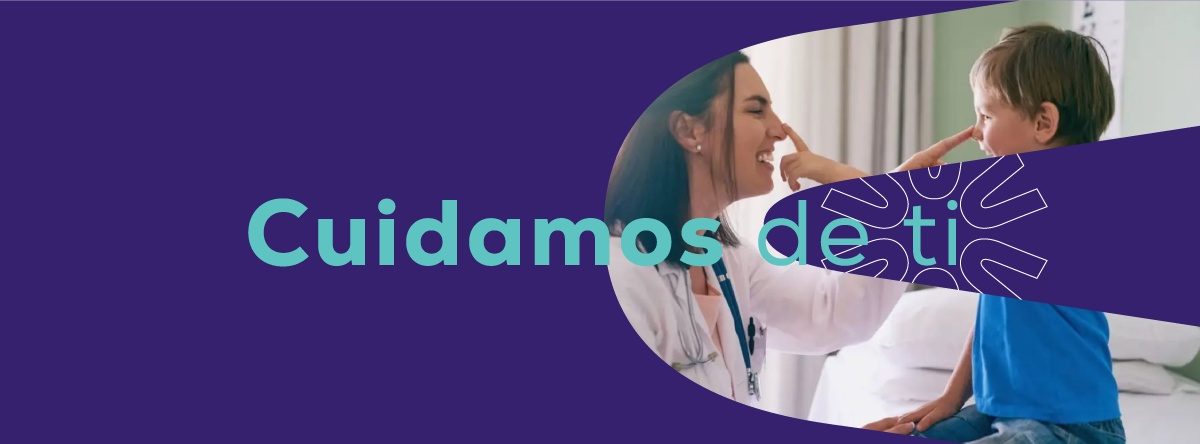
Virtud Medica educates, prevents, promotes, and treats patients to help them achieve better health and a higher quality of life. Through empathetic, professional, accurate, and timely high-quality care, patients enjoy efficient service and receive the right diagnosis, giving them peace of mind knowing they are in good hands.
Virtud Medica educates, prevents, promotes, and treats patients to help them achieve better health and a higher quality of life. Through empathetic, professional, accurate, and timely high-quality care, patients enjoy efficient service and receive the right diagnosis, giving them peace of mind knowing they are in good hands.
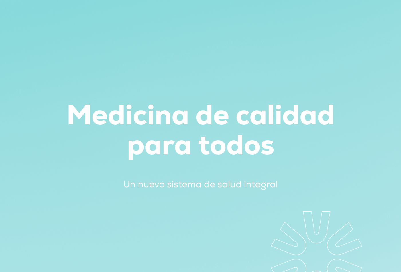
As a brand-new medical venture entering a highly challenging market, the client required a complete, ground-up foundation, including naming, brand development, and a comprehensive visual identity that would accurately reflect their corporate vision. Their primary purpose was to democratize quality healthcare services in Mexico, providing accessible medical treatments to a population that has historically grown distrustful due to exorbitant prices and poor-quality care. Virtud Medica sought to position themselves as the premier go-to option for everyday medical needs.
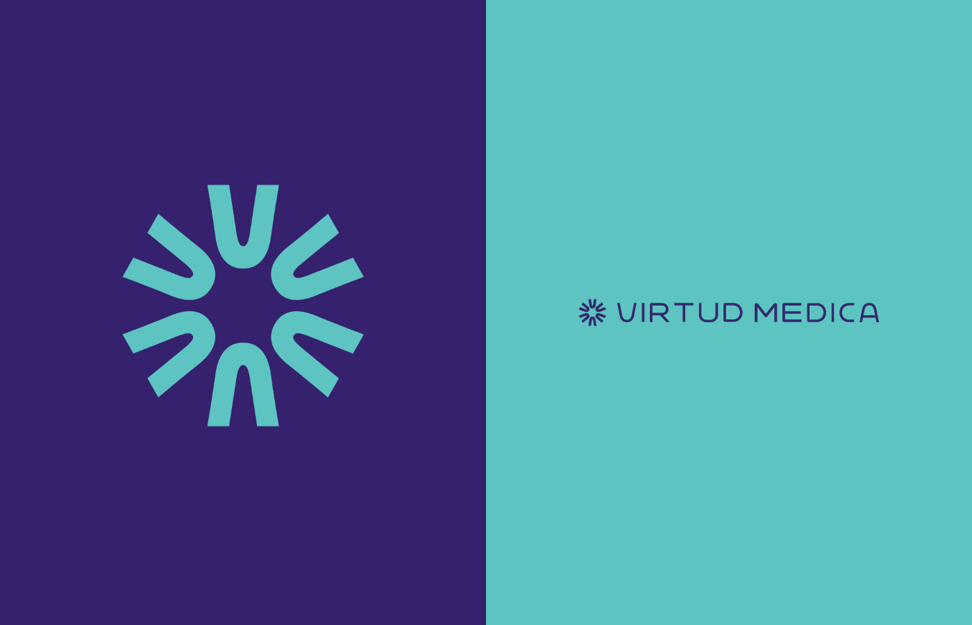
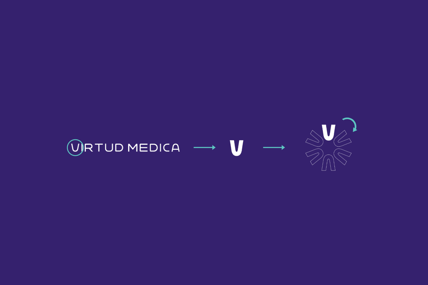
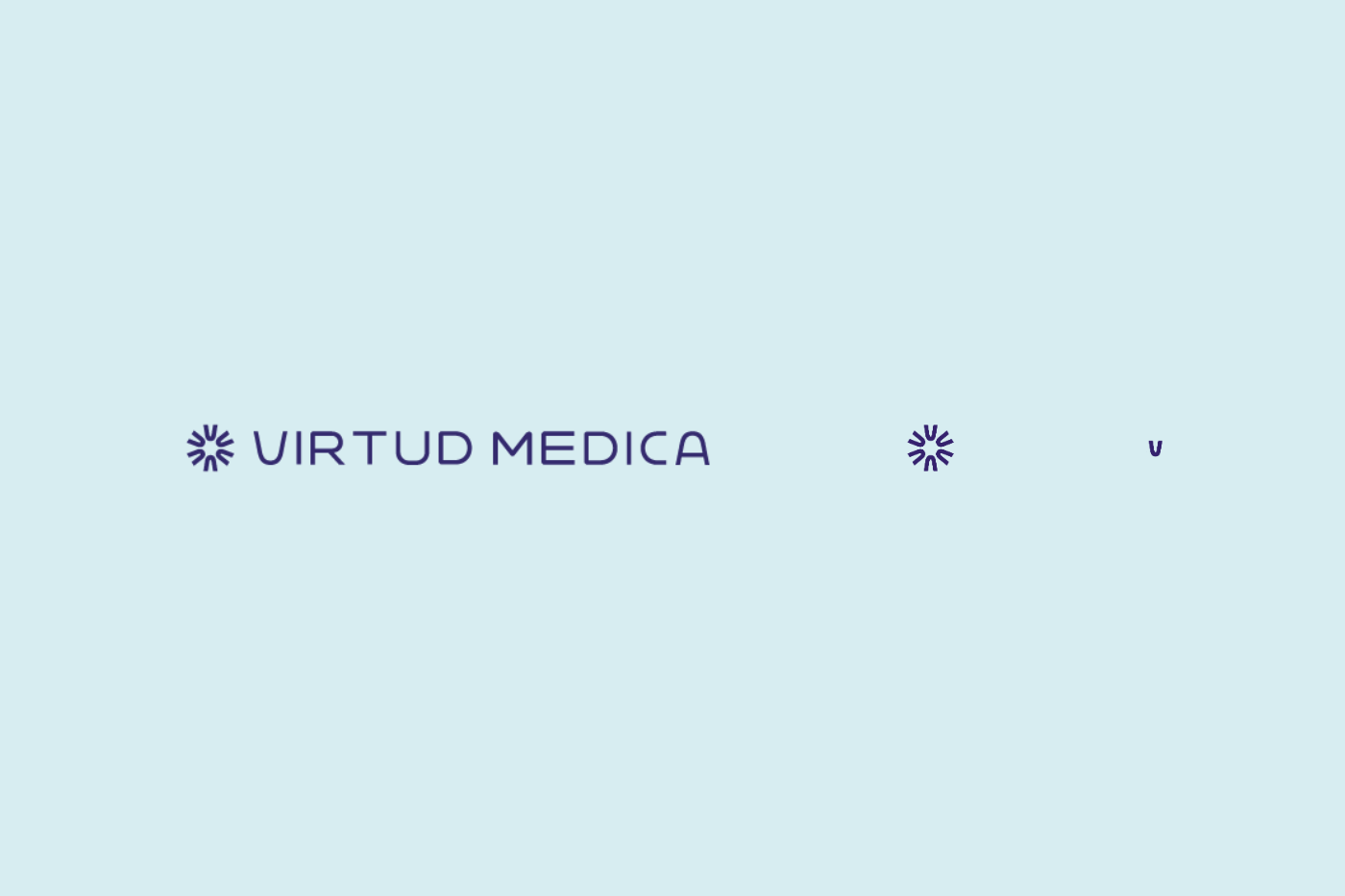
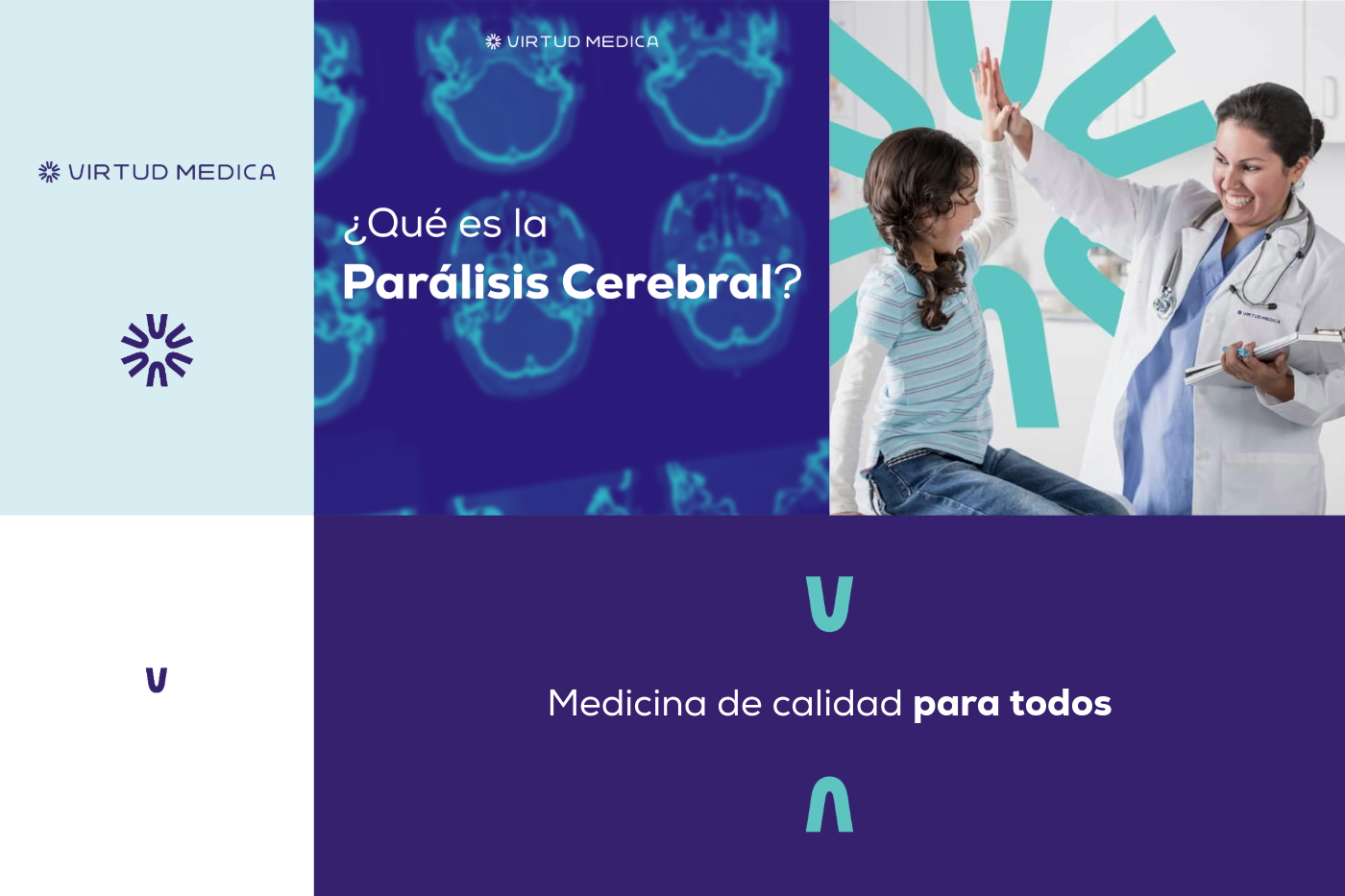
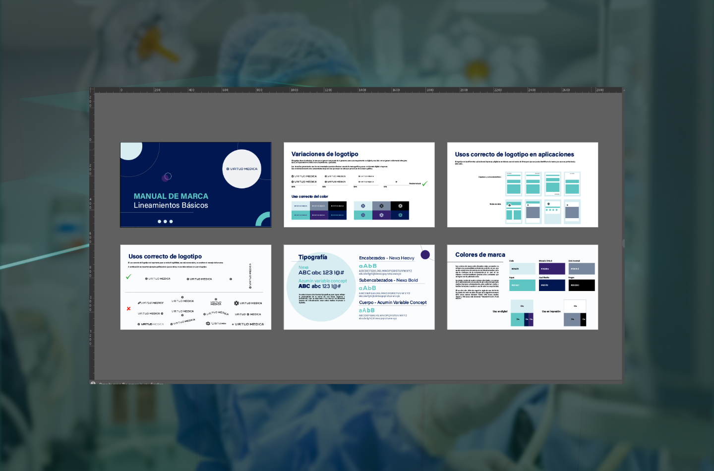
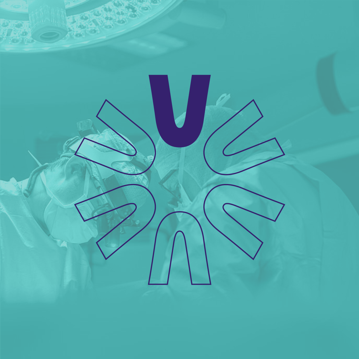
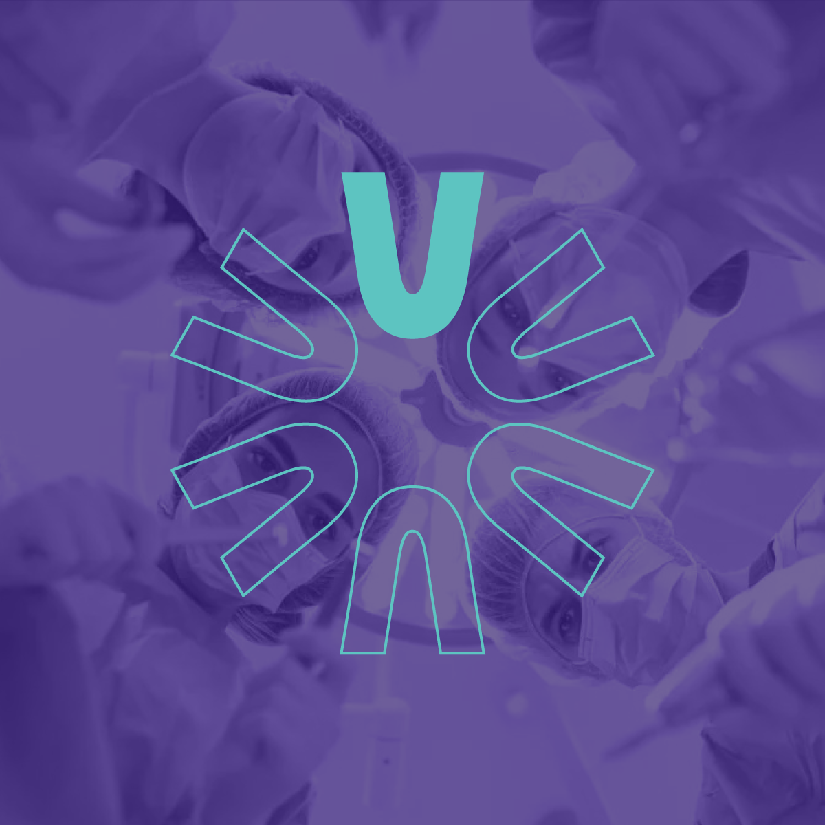
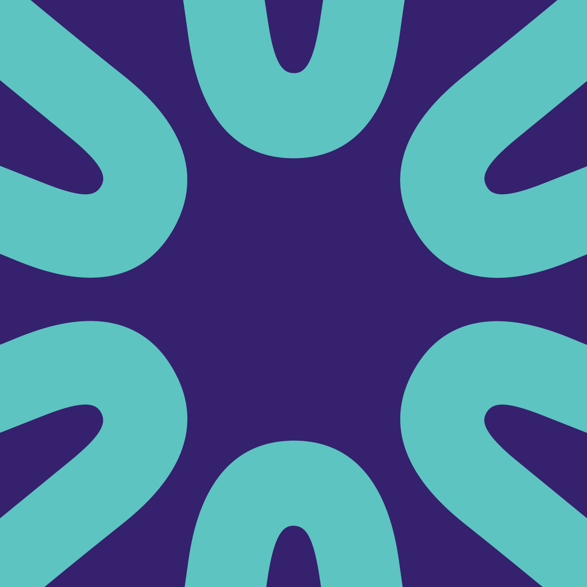
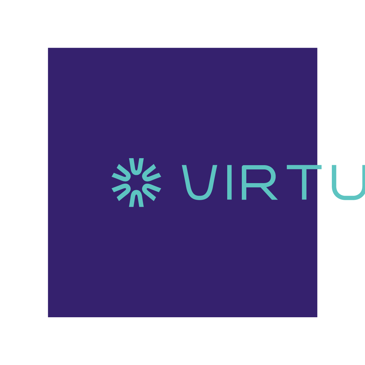
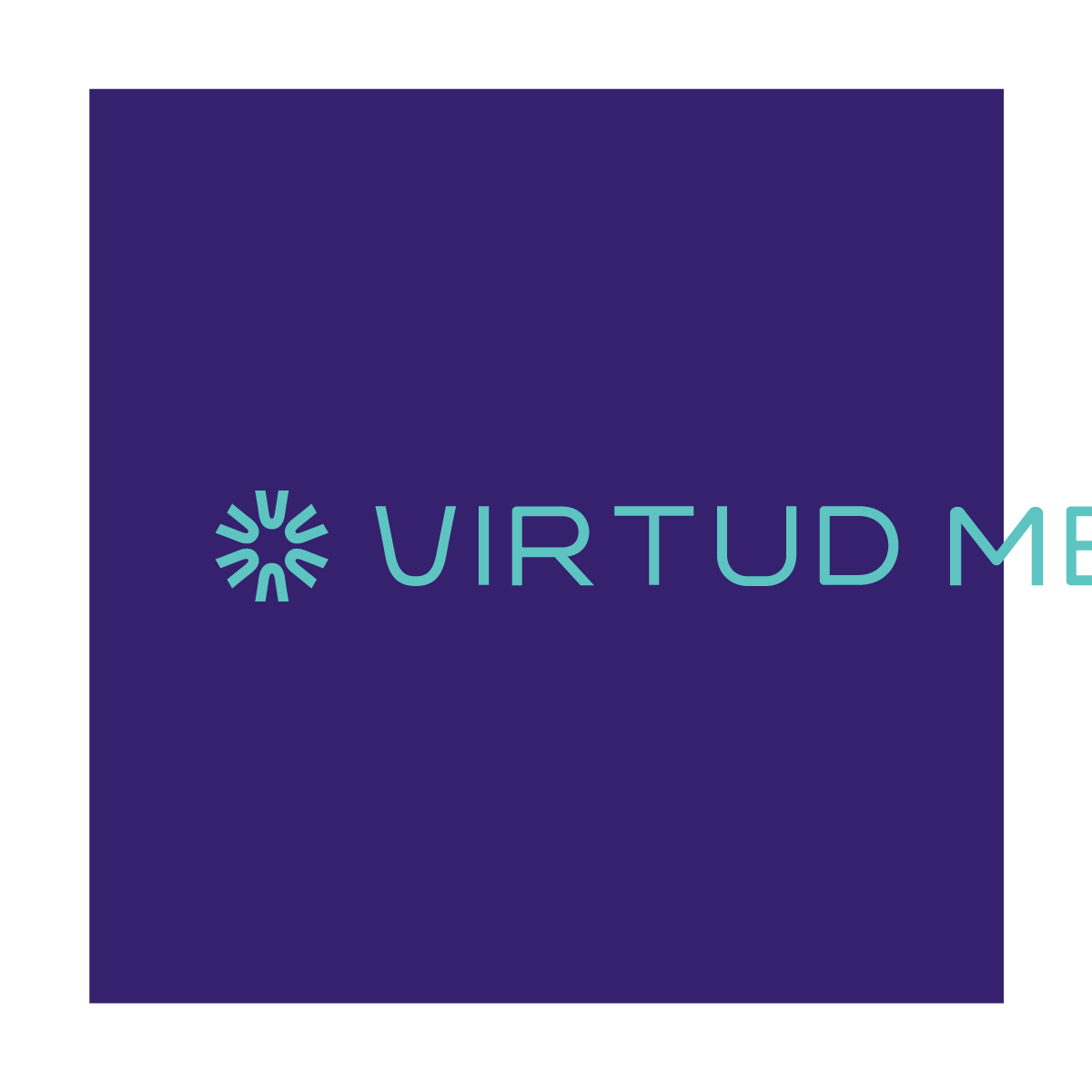
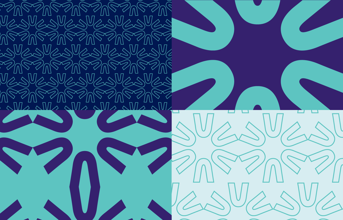
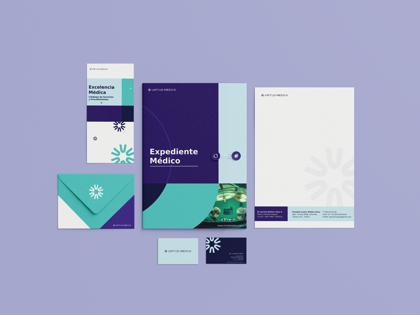
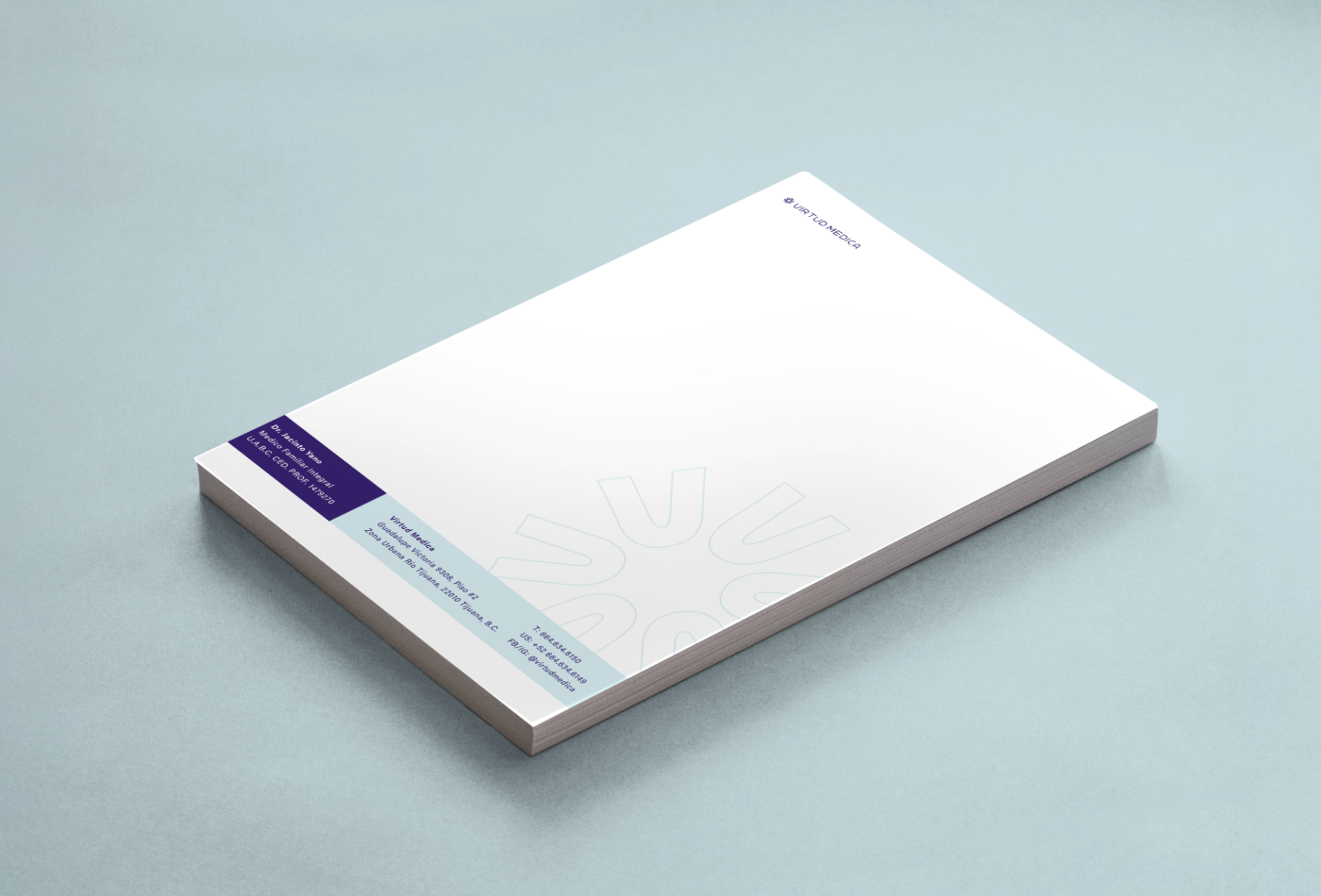
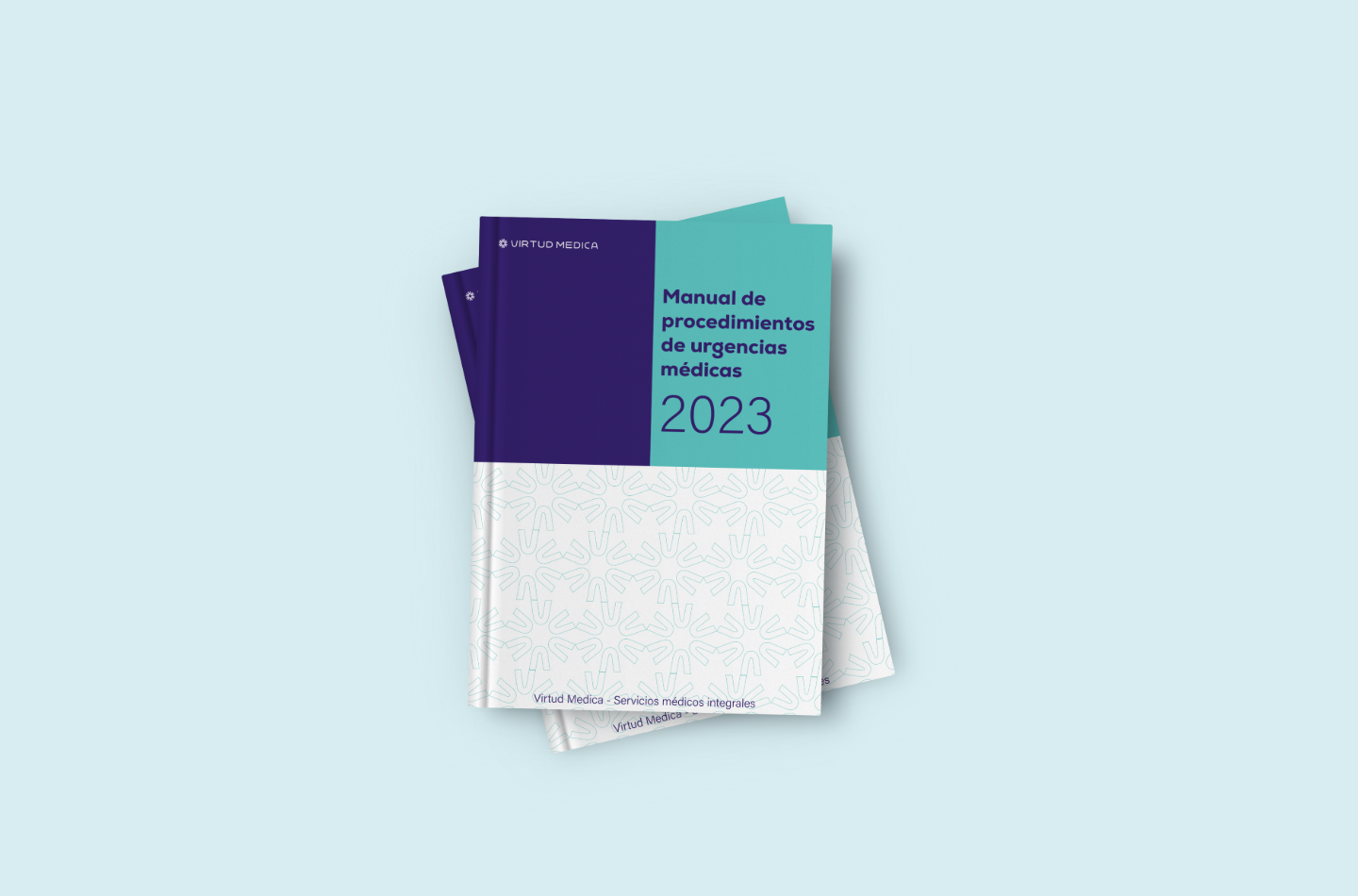
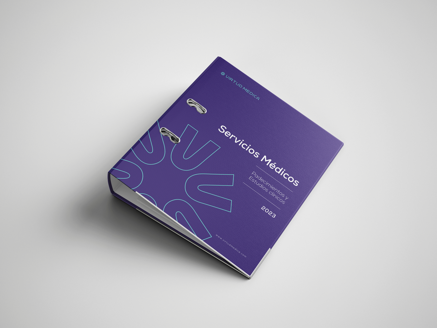
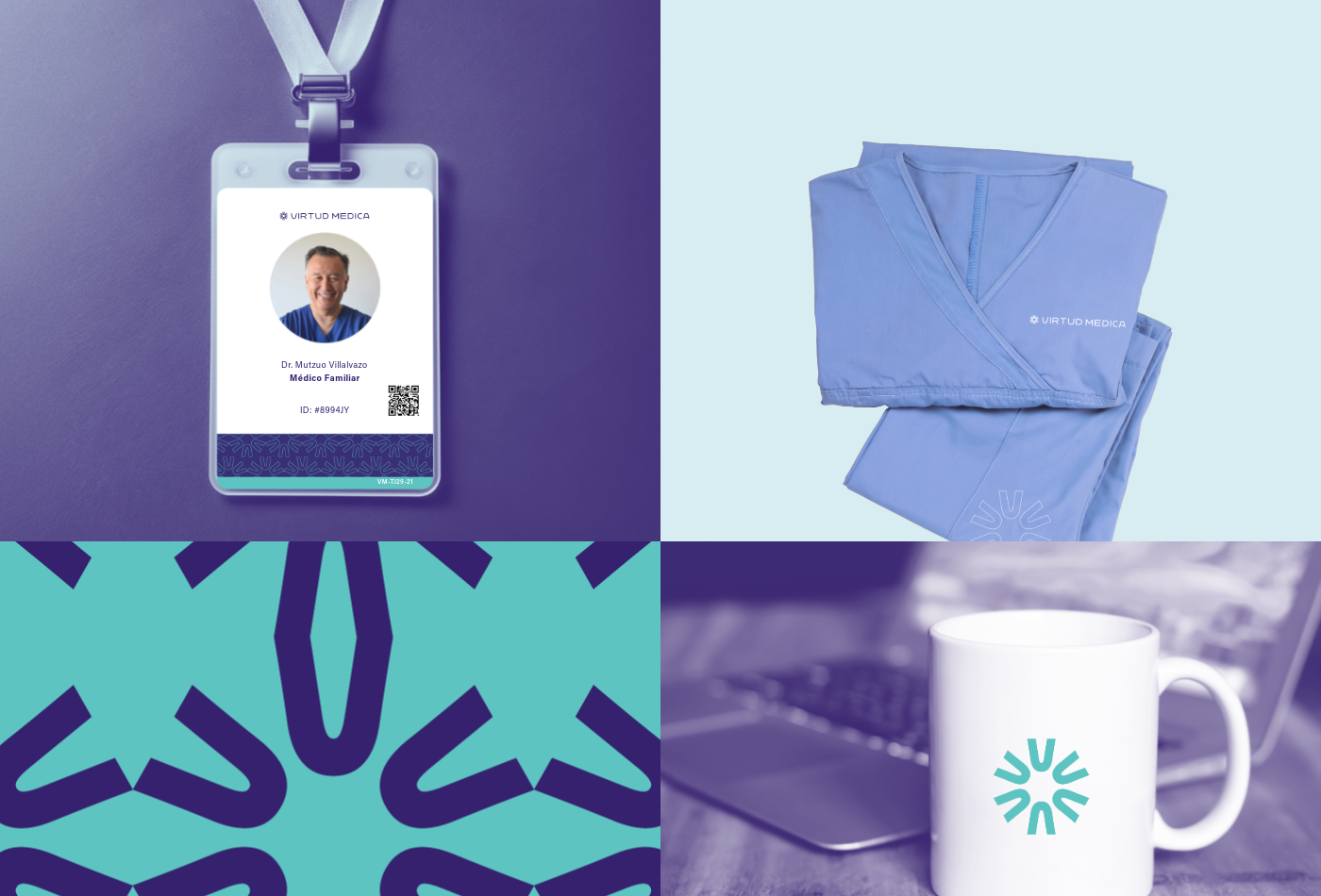
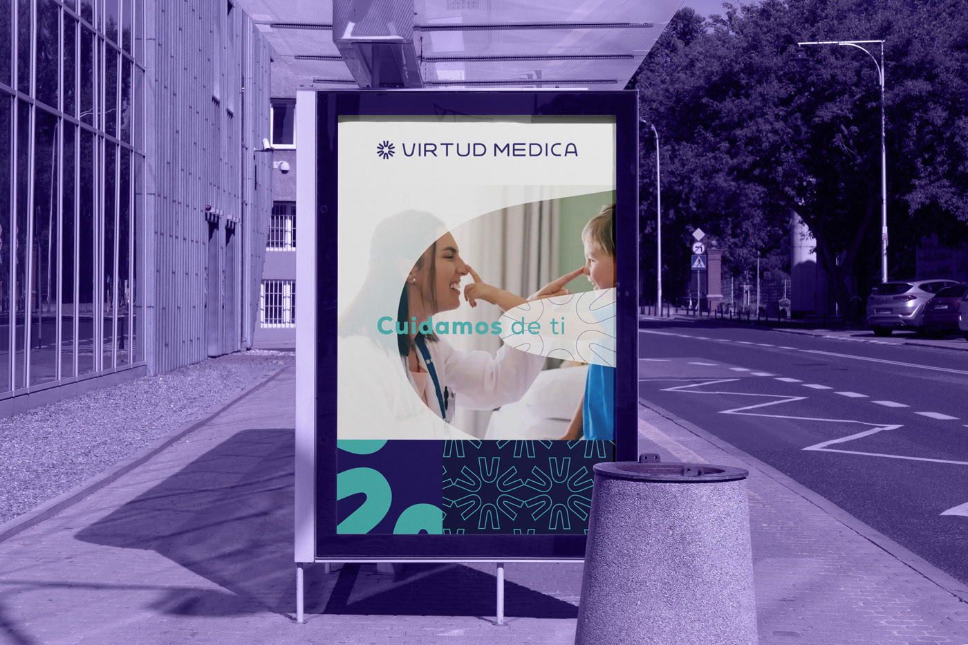
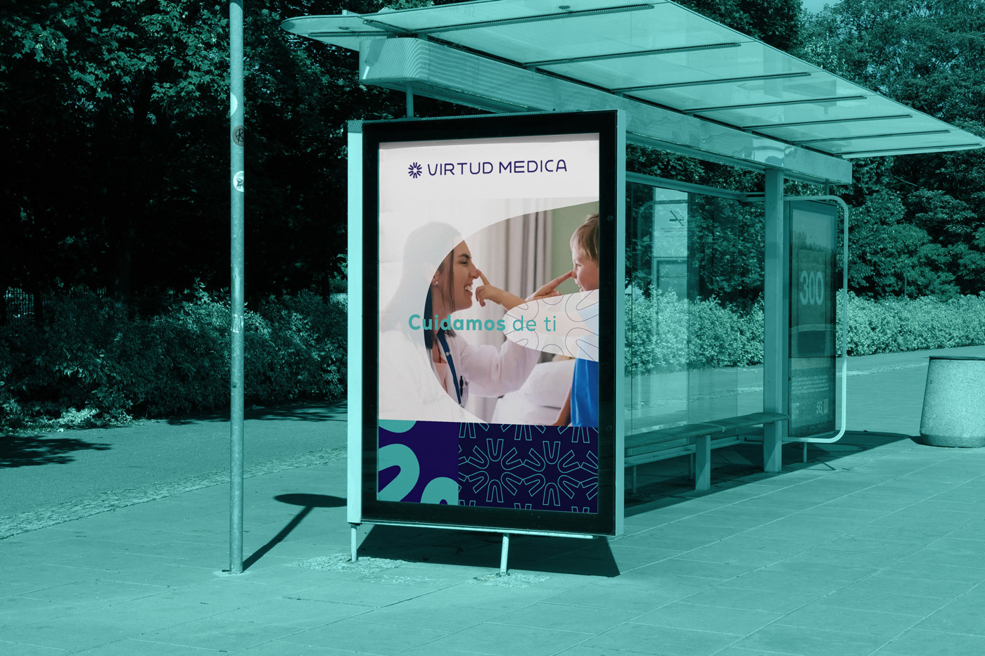
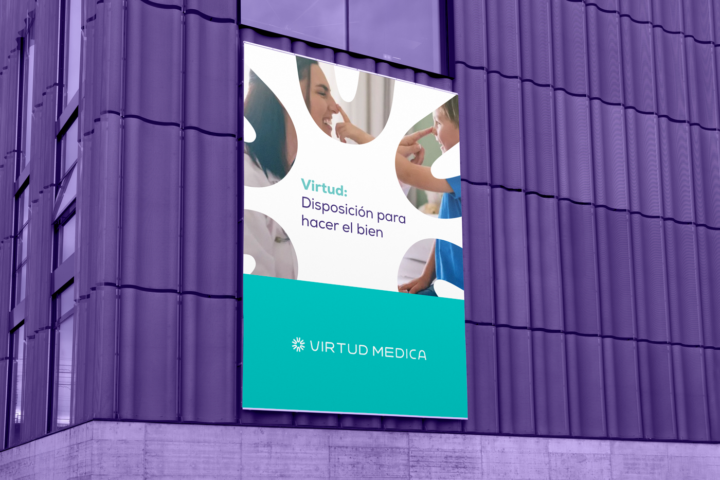
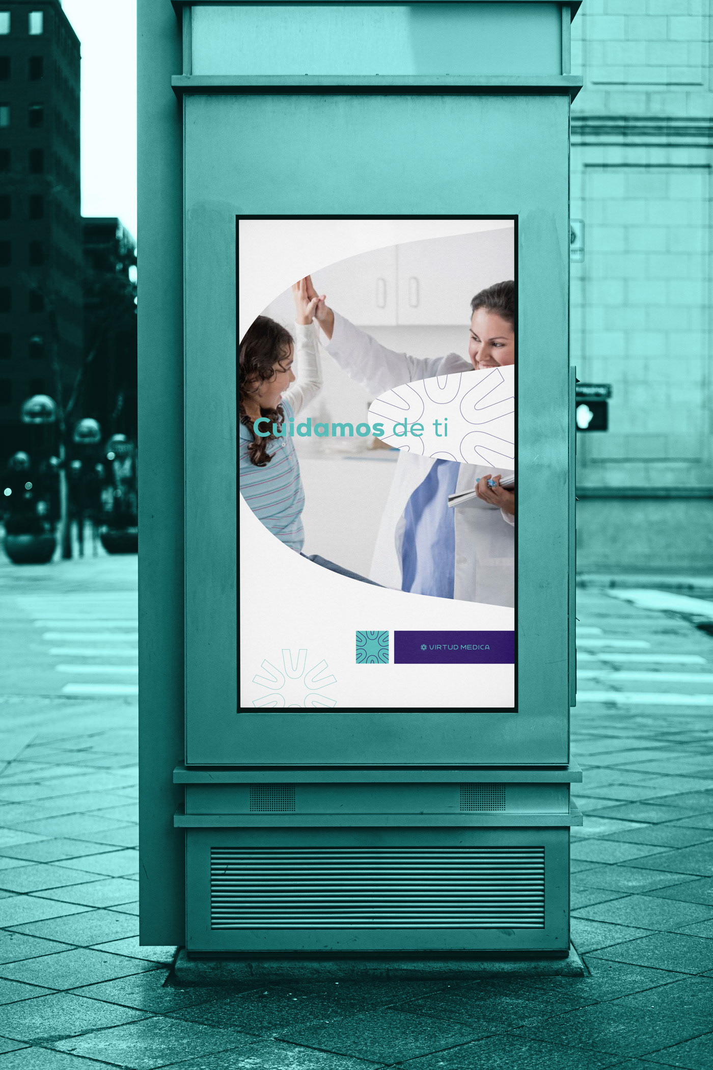
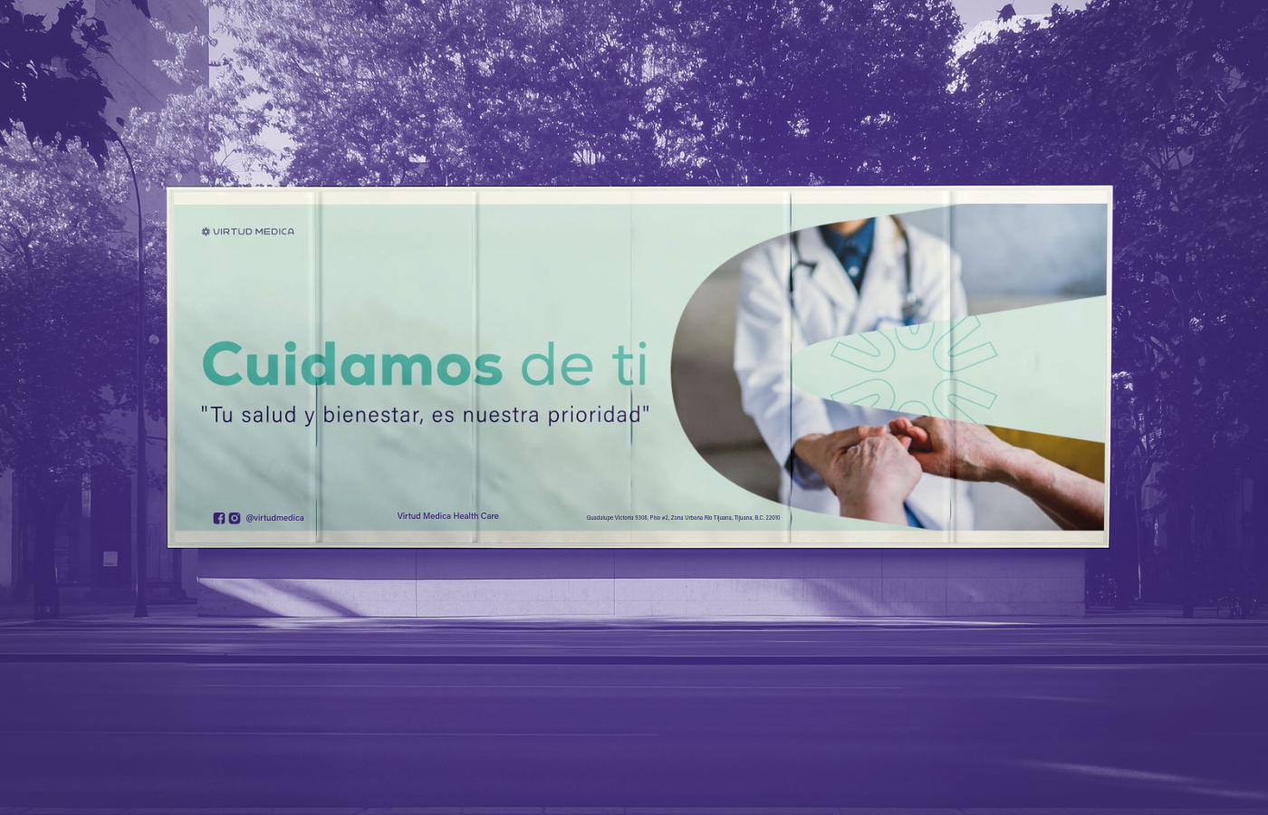
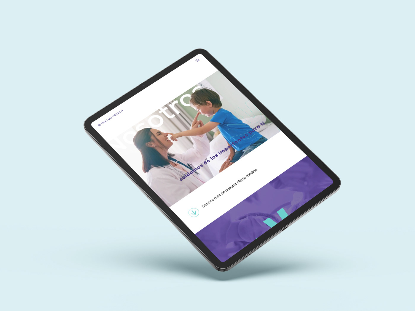
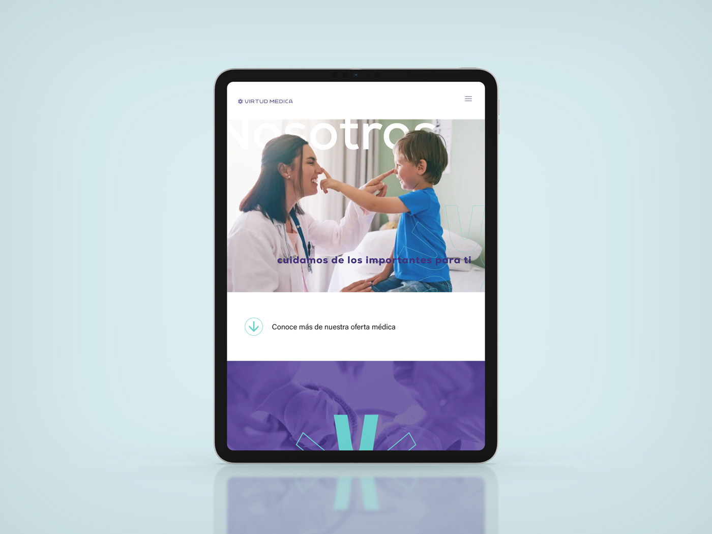
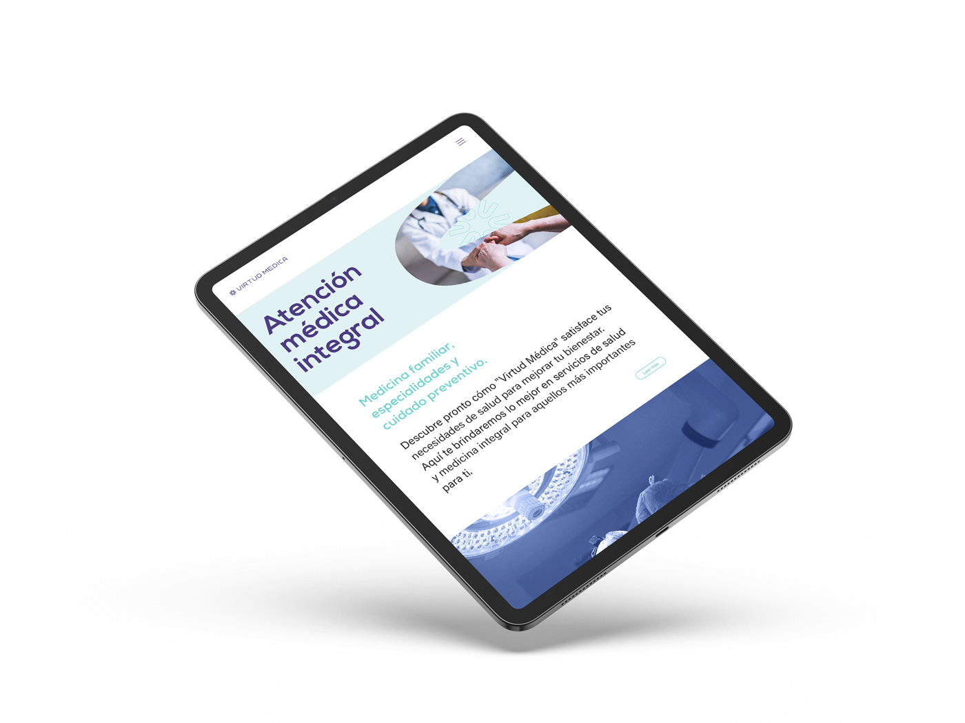
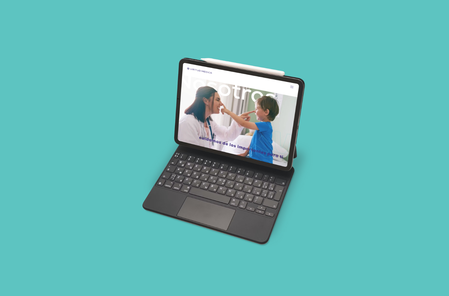
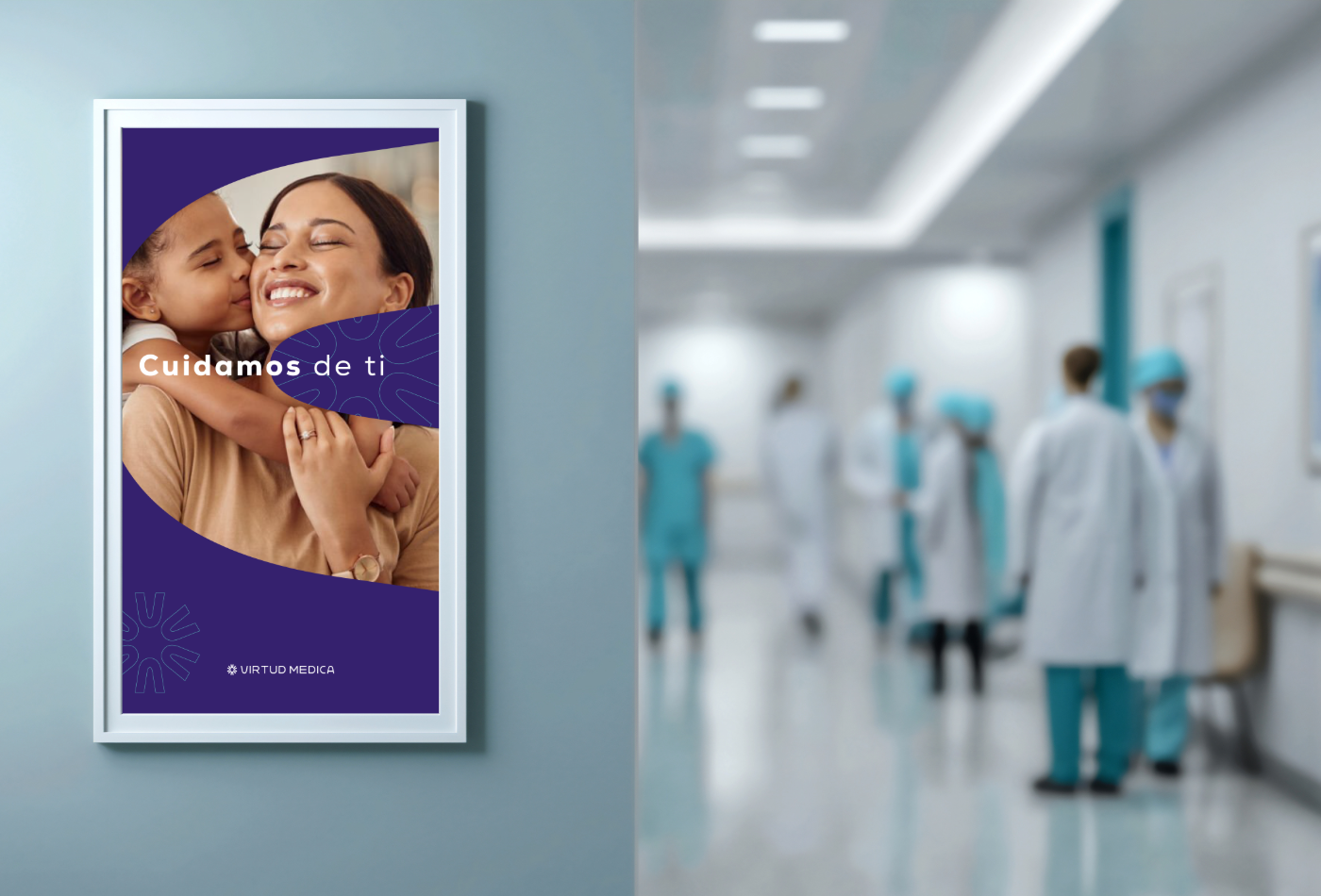
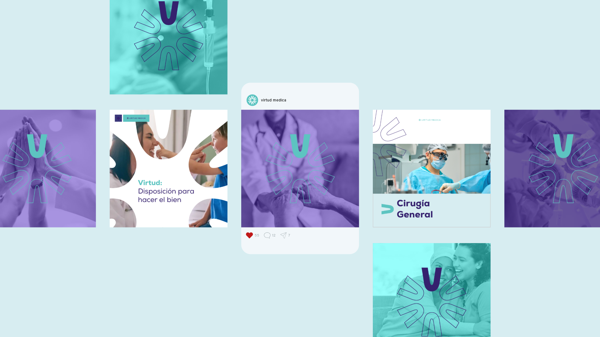
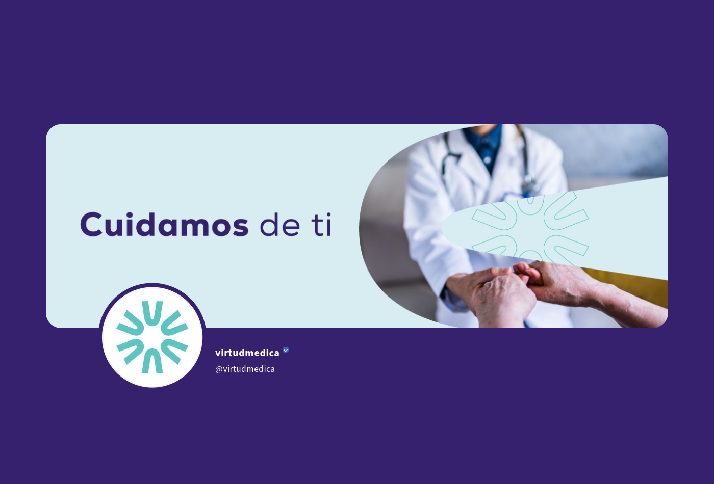
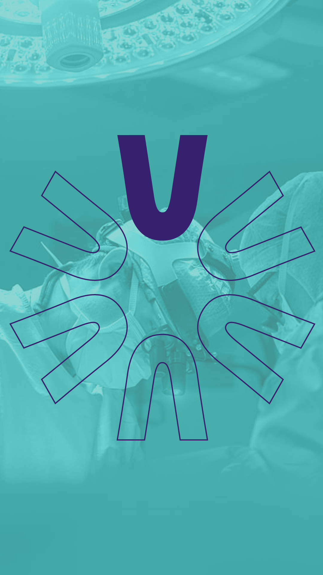
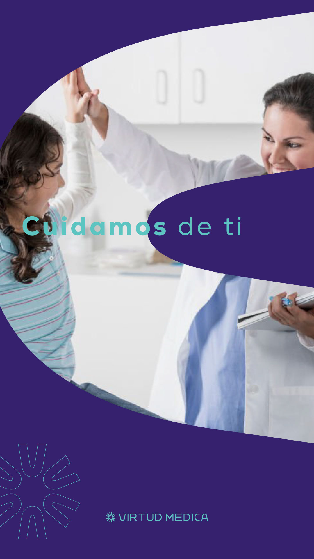
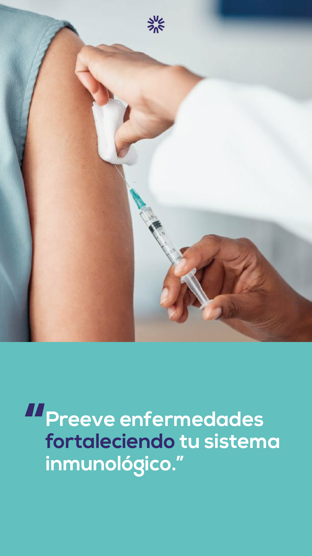
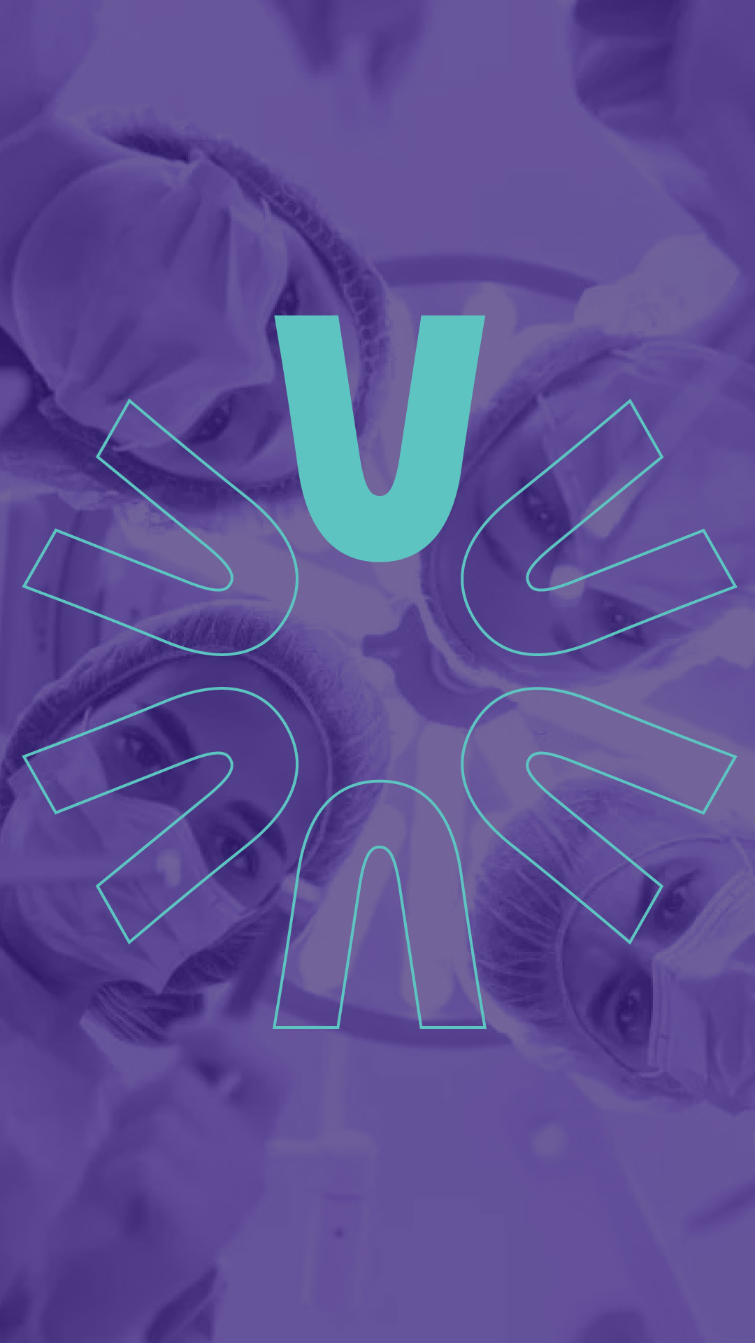
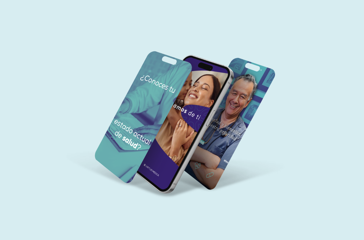
To build lasting trust and connect deeply with future patients, the identity needed to feel impeccably professional yet inherently open and approachable. We answered this brief by crafting a custom logo featuring friendly, rounded shapes anchored by clean, disciplined edges. Moving away from cold, sterile clinical blues, we developed a distinctive, warm palette of light turquoise and purple, paired with welcoming, human-centric imagery. To ensure a cohesive and premium brand experience across every touchpoint, the final rollout included full stationery design, a dedicated membership card, and a comprehensive social media suite encompassing templates, cohesive profile assets, story highlight covers, and platform headers.
To build lasting trust and connect deeply with future patients, the identity needed to feel impeccably professional yet inherently open and approachable. We answered this brief by crafting a custom logo featuring friendly, rounded shapes anchored by clean, disciplined edges. Moving away from cold, sterile clinical blues, we developed a distinctive, warm palette of light turquoise and purple, paired with welcoming, human-centric imagery. To ensure a cohesive and premium brand experience across every touchpoint, the final rollout included full stationery design, a dedicated membership card, and a comprehensive social media suite encompassing templates, cohesive profile assets, story highlight covers, and platform headers.